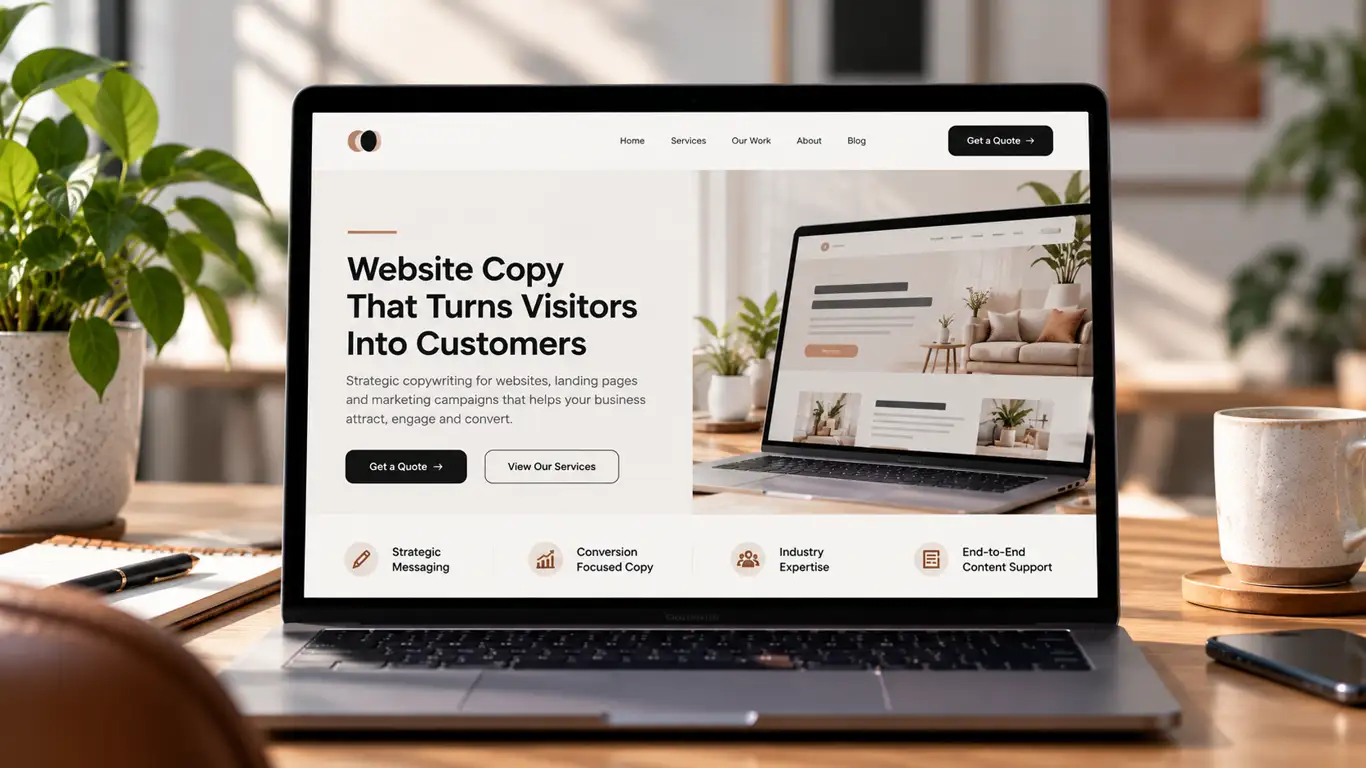
The short answer
Start with the opening section: make sure visitors can understand your offer, audience and main benefit immediately. Then check whether the CTA is clear, contact options work, the page provides convincing evidence and the mobile experience is straightforward. Use performance data to decide what to test next.
Your website is getting visitors, but the enquiries aren't coming in. People land on your pages, have a look around and leave without filling in a form, booking a call or buying anything. Sound familiar?
Before you spend more money on advertising, redesign your website or publish another 20 blog posts, take a closer look at your copy. Your website might not have a traffic problem. It might have a communication problem.
I've seen businesses put considerable effort into their branding, website design and marketing, yet leave visitors guessing about what they actually offer, who their services are for and what makes them worth choosing. When the message isn't clear, even a beautifully designed website can struggle to turn interest into enquiries.
The good news? You don't always need to rebuild your website from scratch. Sometimes, a clearer headline, a stronger value proposition, better page structure or a more accessible call to action can make a meaningful difference.
Let's look at how to fix website copy that isn't converting, what to prioritise first and how to make your website work harder for your business.
What you will learn
- 1. Make It Clear What You Offer Before the First Scroll
- 2. Give Visitors More Than One Way to Contact You
- 3. Cut the Fluff and Give Every Section a Purpose
- 4. Explain Why Customers Should Choose You
- 5. Compare Your Offer With the Alternatives
1. Make It Clear What You Offer Before the First Scroll
Your website should tell visitors what your business does, who it helps and why they should care before they need to scroll down the page. If someone has to hunt for this information, you risk losing their attention before they've understood your offer.

This is where I'd start every website copy review.
Imagine a business offering cybersecurity services to growing companies. Its homepage headline reads:
“Building a Safer Digital Future.”
It sounds professional, but it doesn't tell visitors what the company actually does, who it serves or what problem it solves.
Now consider this alternative:
“Cybersecurity Services That Help Growing Businesses Protect Their Data and Reduce Risk.”
The second version gives visitors a much clearer idea of the service and its value. Someone looking for cybersecurity support can immediately decide whether the offer is relevant to them.
Your opening section, often called the hero section, should answer three questions:
- What do you offer? State your main product or service clearly.
- Who is it for? Help your ideal customer recognise themselves.
- What should they do next? Give them an obvious next step.
Your primary call-to-action (CTA) should also appear here. Depending on your business, that might be “Get a Quote”, “Book a Consultation”, “Explore Services” or “Start Your Free Trial”.
You can still use creative taglines, clever headlines and brand storytelling. Just make sure they support your main message rather than replace it.
My take: Clarity should come before cleverness. Your opening section isn't the place to make visitors solve a puzzle. Tell them why they're in the right place, then give them a reason to keep reading.
2. Give Visitors More Than One Way to Contact You
Your website should offer clear contact options because different customers prefer different ways of getting in touch. Some want to complete a form, others would rather call, and many prefer sending a quick email or WhatsApp message.
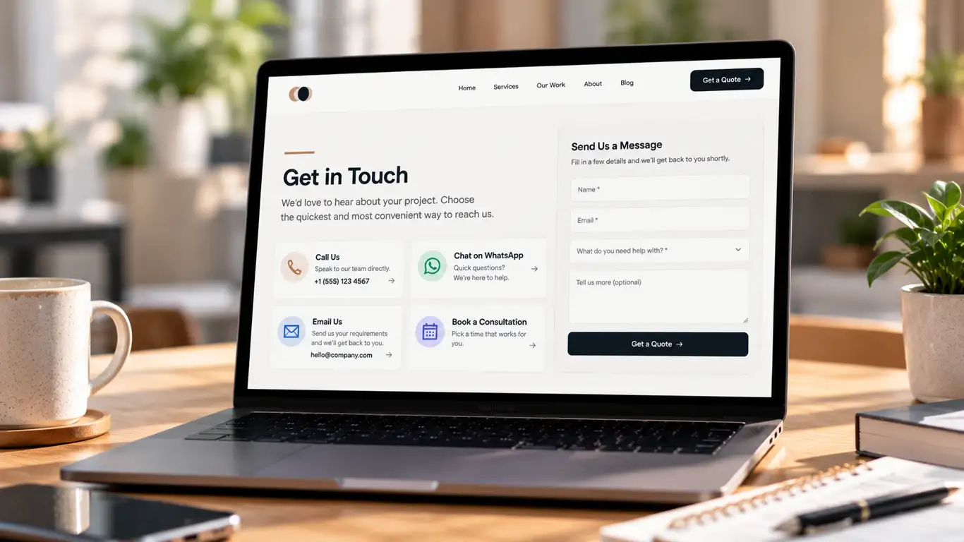
I wouldn't rely on a single contact form as the only route to an enquiry.
Consider a potential customer who needs a quote for a project. They might be happy to provide their details through a form. Another customer may have a few questions before committing and prefer to speak to someone. A third may be browsing outside business hours and want to send an email they can return to later.
If your website only offers one contact method, you could create unnecessary friction for people who are otherwise ready to enquire.
Depending on your business model, consider offering two or three clear options:
| Contact option | Best suited to | Suggested CTA |
|---|---|---|
| Enquiry form | Customers who want to explain their requirements | Get a Quote |
| Phone call | Customers who prefer a direct conversation | Speak to Our Team |
| WhatsApp or live chat | Visitors with quick questions | Chat With Us |
| Customers who prefer written communication | Email Our Team | |
| Booking calendar | Prospects ready to discuss a project | Book a Consultation |
You don't need every option on every page. Choose the methods your team can manage reliably, and make the preferred option easy to find.
Keep forms short enough to complete comfortably. Ask for the information you genuinely need to respond, rather than turning a simple enquiry into a lengthy questionnaire.
Also, make sure your contact details work. Test the phone number, email link, chat functionality and form submission on desktop and mobile. A beautifully written CTA is useless if the button doesn't work.
My take: Make it easy for people to start a conversation in the way that suits them. The objective isn't to give visitors more decisions to make; it's to remove barriers between interest and action.
3. Cut the Fluff and Give Every Section a Purpose
Good website copy doesn't need to be long to be effective. It needs to answer the right questions, in the right order, without making visitors work harder than necessary.
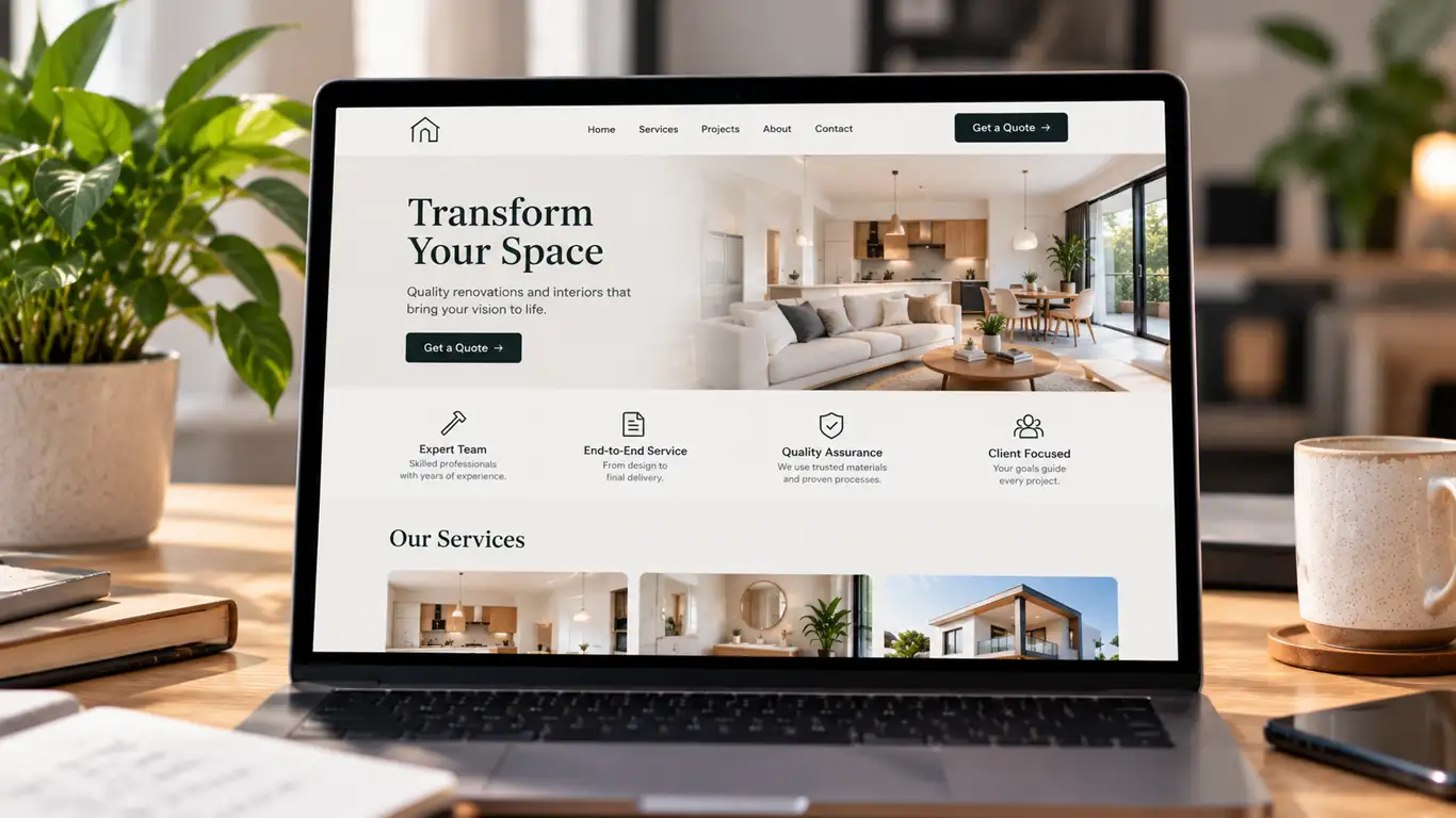
The days of adding bulk content simply to make a page look substantial are gone. A website filled with repetitive paragraphs, vague promises and unnecessary explanations can bury the information customers actually need.
This doesn't mean every page should be short. A complex service may require detailed explanations, examples, specifications and FAQs. The point is to make every section useful.
For each paragraph, ask yourself:
- Does this explain what we do?
- Does it help customers understand the value of our offer?
- Does it answer a question or address an objection?
- Does it provide evidence, an example or useful detail?
- Does it help the reader decide what to do next?
If a section does none of these things, consider rewriting it, combining it with another section or removing it.
For example, a generic statement such as:
“We are committed to providing innovative, customer-centric solutions that empower businesses to achieve excellence.”
Could become:
“We help growing businesses improve their websites, sharpen their messaging and turn more visitors into qualified enquiries.”
The revised version tells readers what the business does and the outcome it works towards.
Use short paragraphs, descriptive subheadings, bullet points and enough white space to make the page easy to scan. Keep essential information visible without forcing readers through long blocks of text.
My take: I'd rather publish five useful sections that answer real customer questions than fifteen sections that repeat the same promise in different words. Quality, clarity and strategy matter more than word count alone.
4. Explain Why Customers Should Choose You
Your website needs to explain what makes your business worth choosing over the alternatives. Listing services isn't enough if every competitor appears to offer the same thing.
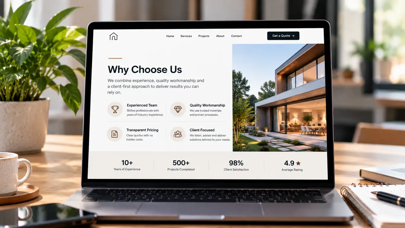
Your unique selling points (USPs) should give customers a reason to consider your business. These might include a specialist approach, a particular production method, a useful feature, a clear service model, specialist expertise or a demonstrable advantage.
Start by identifying what genuinely differentiates your offer.
For a software company, that could be a feature that saves users time. For a professional services firm, it might be a specialist team or a clearly defined process. For an e-commerce brand, it could be product materials, customisation options, a warranty or a distinctive design.
Then turn those differences into customer benefits.
| Generic statement | More useful website copy |
|---|---|
| We offer excellent customer service. | Get a dedicated point of contact throughout your project. |
| Our software is easy to use. | Manage your projects from one dashboard without switching between multiple tools. |
| We provide high-quality products. | Each product is made using specified materials and includes clear care instructions. |
| We offer tailored solutions. | Choose a service scope based on your team's requirements and budget. |
These are illustrative examples, not claims you should use without checking that they accurately describe your business.
Notice the difference? The improved statements explain what the customer actually gets.
Also, distinguish between features and benefits. A feature describes what something has or does. A benefit explains why that feature matters to the buyer.
For example, a project management platform might offer automated reminders. The benefit could be fewer missed deadlines and less time spent chasing updates.
Your website should communicate both. Features help customers understand the offer; benefits help them understand its relevance.
My take: Don't simply tell people that your business is better. Show them what makes it different, explain why that difference matters and support your claims with evidence wherever possible.
5. Compare Your Offer With the Alternatives
Customers rarely make decisions in isolation. They're comparing providers, products, prices, features and levels of service, even if they never tell you.
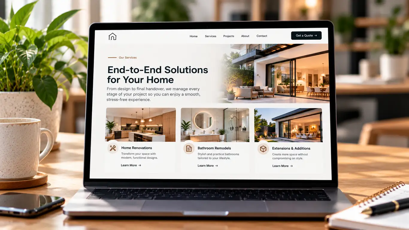
Your website can help them make that decision by explaining how your offer differs from other options available in the market.
You don't need to name competitors or make negative claims about other businesses. Instead, focus on the differences that matter to your audience.
For example, a company selling project management software might compare its own features against common approaches such as spreadsheets, disconnected tools and dedicated project management platforms.
A website copywriting agency could explain the differences between a one-off website rewrite, ongoing content support and a conversion-focused copywriting project.
A simple comparison table can make these distinctions easier to understand:
| What customers compare | Option A: Basic service | Option B: Specialist service |
|---|---|---|
| Scope | Standard deliverables | Defined around specific business needs |
| Research | Limited initial research | Audience, competitor and search intent research |
| Strategy | Primarily execution-led | Messaging and conversion goals established upfront |
| Measurement | Delivery-focused | Success measures agreed before work begins |
This is an illustrative comparison, not a claim that every provider in either category works this way. Adapt the criteria to your actual offer and use verifiable information.
If you sell several packages, explain who each one suits, what is included and where the differences lie. If your product has a feature that competing solutions commonly lack, explain the feature and its practical benefit without making unsupported claims about named competitors.
My take: A good comparison page helps customers understand their options rather than simply telling them you're the best. Honest comparisons can also filter out unsuitable enquiries and help the right prospects move forward with confidence.
6. Use Tables, Charts and Visuals to Make Information Easier to Understand
Tables, charts, screenshots and infographics can help visitors understand complicated information more quickly. They are particularly useful when you need to explain processes, compare options, show results or break down technical details.
However, visuals should serve a purpose. Adding graphics simply to make a page look busy won't fix unclear messaging.
Here are a few practical ways to use them:
Use tables for comparisons. If customers need to compare service packages, product specifications or pricing, a well-organised table may be clearer than several paragraphs.
Use charts for meaningful data. A chart can illustrate a real trend, survey finding, performance measure or before-and-after comparison. Label the axes, explain the data source and provide context. Don't use a chart if the information is easier to understand in one sentence.
Use infographics for processes. A simple visual showing how your service works, what happens after an enquiry or how a customer moves from problem to solution can reduce uncertainty.
Use screenshots and annotated examples. For software, technical services or website projects, showing the actual interface or explaining a real page improvement may be more useful than describing it abstractly.
Add descriptive alternative text to meaningful images. This helps people using assistive technology understand the image and provides additional context about its purpose.
For this article, a useful infographic could show the journey from a confusing homepage to a clearer, conversion-focused page:
A simple website copy improvement journey
- Clarify the offer.
- Identify the ideal customer.
- State the main benefit.
- Add evidence and relevant USPs.
- Make the next action obvious.
- Test the page and improve it using real data.
Keep the visual accessible, readable on mobile and consistent with your brand. Important information should also appear in the surrounding page copy rather than existing only inside an image.
My take: Use visuals to make your message easier to understand, not to compensate for a message that isn't clear in the first place.
7. Write Landing Page Copy Around One Clear Goal
A landing page is more effective when its content supports a specific action. If you want visitors to book a consultation, request a quote or purchase a product, structure the page around that objective rather than giving every message equal importance.
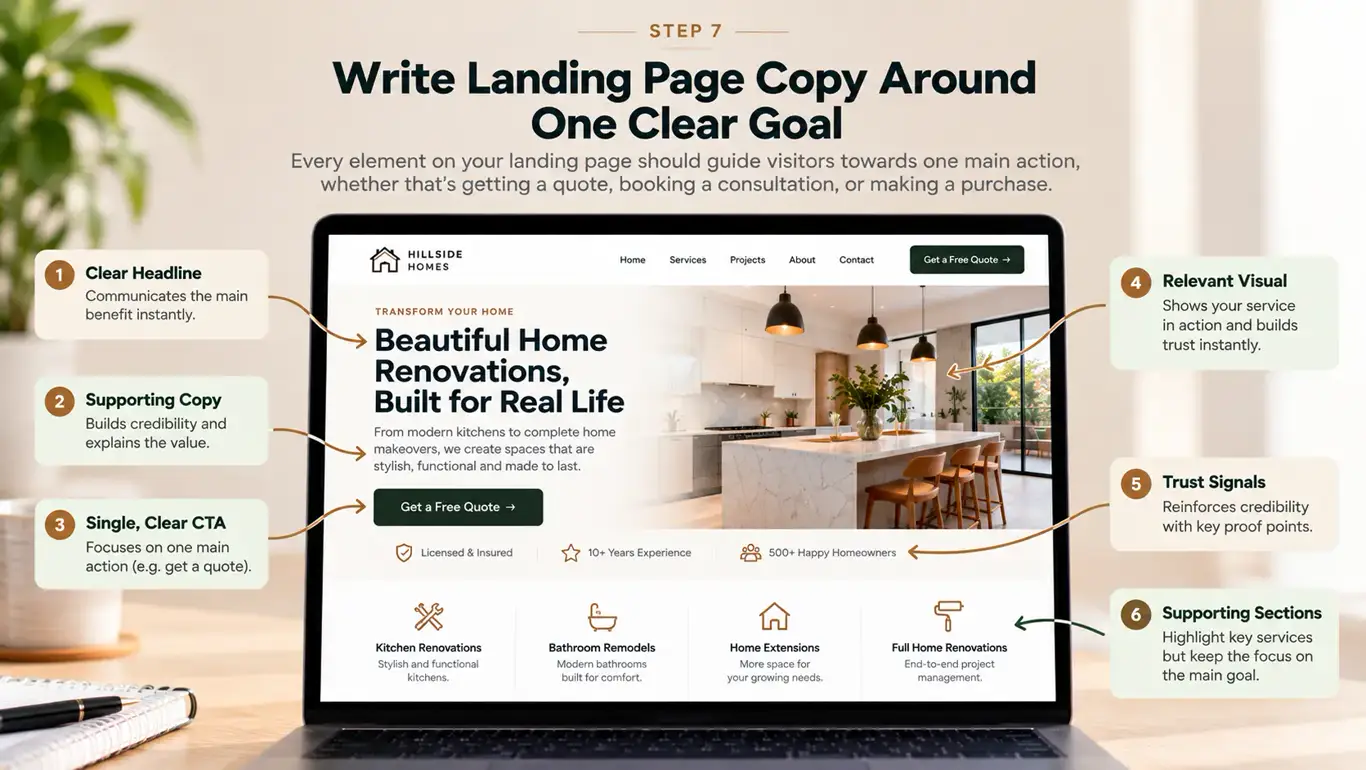
Start with the reason the visitor arrived. Someone clicking an ad about a particular service should land on a page that clearly addresses that service, not a generic homepage where they have to find the relevant information themselves.
A useful landing page structure looks like this:
| Page section | What it should communicate |
|---|---|
| Headline | What the offer is and who it helps |
| Opening copy | Why the offer is relevant to the visitor |
| Benefits | What the customer stands to gain |
| Features and scope | What's included and how it works |
| Evidence | Relevant reviews, examples, case studies or credentials |
| Objections and FAQs | Answers to common concerns |
| CTA | The specific action the visitor should take |
For example, a landing page for a website copywriting service might open with:
“Website Copy That Makes Your Offer Clear and Gives Customers a Reason to Act.”
The supporting copy could explain which pages the service covers, how the project works and what information the business needs to provide. A CTA such as “Discuss Your Website Project” would then give interested visitors a clear next step.
This is where landing page copy needs a different approach from a general informational article. A landing page should stay focused on the visitor's immediate need and remove distractions that could interrupt the decision.
That doesn't mean removing every navigation link or forcing customers down a single path. It means giving the main conversion goal a clear position while keeping essential information accessible.
My take: Match the page to the promise that brought the visitor there. If your ad promotes one specific service, make sure the landing page continues that conversation instead of starting a completely different one.
8. Use AI to Research Competitors, Then Add Your Own Thinking
AI tools can help you analyse competing websites, organise research and identify areas where your own website may be falling behind. Used well, they can speed up the research process and help you ask better questions.
Start by identifying businesses that appear in search results for your target services. Review their homepage messaging, service pages, calls to action, pricing information, proof points, FAQs and content structure.
You can then use an AI tool to organise your observations and identify patterns.
For example, you could provide the tool with publicly available competitor page text and ask:
“Analyse these website pages from the perspective of a potential customer. Compare how clearly each business explains its offer, target audience, main benefits, differentiators, proof points and next steps. Identify questions that remain unanswered, information customers may need before enquiring, and opportunities for our website to communicate our offer more clearly. Do not copy the competitors' wording or assume that their claims are true.”
This can help you identify potential gaps, such as:
- Competitors explaining their process more clearly.
- Important service details missing from your own pages.
- Customer objections that your website hasn't addressed.
- Features or benefits that need better explanation.
- Opportunities to demonstrate expertise through original examples.
- Questions that could support a useful FAQ section or a future blog article.
You can also ask AI to compare your current page against a checklist of customer questions. Treat the results as research prompts, not a final verdict.
Don't assume that a competitor's ranking proves its copy is better. Search visibility can depend on many factors, including links, technical accessibility, relevance, reputation and the overall usefulness of the page.
And don't copy a competitor's positioning simply because it seems to be working. Use the analysis to understand what customers need and how your business can answer those needs more convincingly.
My take: AI is useful for spotting patterns and gaps, but it doesn't know your customers, business constraints or actual strengths unless you give it accurate information. Bring your own expertise to the analysis, verify the findings and use them to build a more distinctive website.
9. Make Your Copy Search-Friendly Without Writing for Search Engines Alone
Website copy can be clear and persuasive while also helping search engines understand the page. The key is to identify what your audience is searching for and answer that need directly.
Start with search intent. Someone searching for a copywriting agency may be comparing providers, while someone searching for how to write a landing page may be looking for instructions. The content should match the reason behind the search.
For each important page, identify:
- The primary topic and relevant search terms.
- The questions your audience needs answered.
- The appropriate page type, such as a service page, product page or guide.
- The internal pages that would genuinely help the reader.
- The next step that makes sense for someone reading that page.
Use the main topic in the page title, headline and opening copy where it fits naturally. Include related terms where they accurately describe the offer, but don't repeat keywords simply to increase their frequency.
For example, a page offering website copywriting could naturally explain its approach to homepage messaging, service pages, product pages and landing pages. It doesn't need to repeat the same keyword in every paragraph.
What about AEO and AI search?
Answer Engine Optimisation (AEO) involves making content easy to understand and use when search systems or AI assistants respond to questions. A practical starting point is to answer relevant questions directly, use descriptive headings, explain specialist terms and provide enough context for each answer to make sense.
For example, if your page answers “Why isn't my website converting?”, begin the relevant section with a direct explanation before exploring possible causes. This is useful for readers and makes the page's purpose easier to understand.
There is no guaranteed formula for getting a page featured in an AI-generated answer. Focus on helpful, accurate, well-structured content, clear sourcing and a genuinely useful perspective rather than trying to game a particular system.
Google's guidance on creating helpful, reliable, people-first content is a useful reference for evaluating whether your page delivers genuine value.
My take: Write for the person who needs the answer first. Make the page easy for search systems to interpret, but don't sacrifice natural language, useful detail or the customer's experience to fit a keyword checklist.
10. Don't Forget Internal Links, Metadata and Schema
Strong copy is only one part of a website that performs well. Your page also needs a sensible internal linking structure and correct technical setup so search engines can discover, understand and index it.
Here's what I'd check before publishing or rewriting an important page.
Internal links
Link to relevant pages that help the reader take the next step or explore a related topic. For example, a blog about website conversion can link to your website copywriting service, landing page content and conversion copywriting services.
Use descriptive anchor text that tells readers what they'll find when they click. Avoid relying entirely on vague phrases such as “click here”.
Check that the links work, point to the intended destination and use crawlable HTML links. Google's link best practices explain how links help Google discover pages and understand their context.
Meta title and meta description
Your page title should accurately describe the page and give searchers a reason to visit. Keep it concise and distinctive, and avoid stuffing it with several variations of the same keyword.
A meta description should summarise what the visitor can expect and why the page is useful. Google may generate a different search snippet depending on the query, so a description is not a guarantee of what will appear in search results.
Headings and page structure
Use one clear main heading, followed by logically organised subheadings. Make the headings descriptive enough that someone scanning the page can understand the topics covered.
Avoid choosing headings purely because they contain keywords. They should reflect the information that follows.
Schema markup
Structured data can help search engines interpret the content and may make a page eligible for certain enhanced search appearances. For a blog, relevant Article markup and Breadcrumb markup may be appropriate, provided they accurately reflect the visible page and the website structure.
Validate the markup using Google's general structured data guidelines and relevant testing tools. Correct schema does not guarantee rich results or better rankings.
Technical checks
Before publishing, check the following:
| Element | What to verify |
|---|---|
| Indexability | The page isn't unintentionally blocked or marked noindex. |
| Canonical URL | The preferred URL is correct. |
| Mobile experience | Text, buttons, tables and forms work on small screens. |
| Page speed | Large images, scripts and unnecessary elements aren't creating avoidable delays. |
| Images | Files are relevant, appropriately sized and have useful alt text where needed. |
| Links | Internal and external links work and lead to relevant pages. |
| Sitemap | The page can be discovered through the site's internal links and sitemap where appropriate. |
| Structured data | Markup is accurate, valid and consistent with the visible content. |
| Tracking | Important actions, such as form submissions or bookings, can be measured. |
My take: Don't spend weeks polishing every sentence and then discover that the page isn't indexable, the enquiry form is broken or the CTA doesn't work on mobile. Copy, user experience and technical SEO need to work together.
11. Measure What Happens After You Change the Copy
You can't reliably judge a rewrite by whether it sounds better. You need to look at what visitors do after they encounter it.
Before making changes, record the current performance of the page. Depending on your business, useful measures might include qualified enquiries, form completion rate, booked calls, purchases, CTA clicks and the percentage of visitors who leave without taking a meaningful action.
Then make changes based on the problems you've identified.
For example, if visitors aren't understanding your offer, test a clearer headline. If people read the page but don't enquire, review your proof points, CTA placement and contact options. If mobile visitors struggle to complete a form, investigate the form experience rather than rewriting unrelated paragraphs.
Where possible, test one meaningful change at a time and allow enough data to accumulate before drawing conclusions. Conversion rates can fluctuate because of traffic quality, seasonality, pricing, promotions and other factors.
Don't assume that a higher click-through rate automatically means better business performance. A CTA that attracts more clicks but produces fewer qualified leads may not be an improvement.
My take: Treat website copy as something you can improve through evidence, not guesswork. Your first rewrite doesn't have to be perfect, but it should have a clear purpose and a way to measure whether it helped.
12. When Should You Bring in a Copywriting Agency?
If you've clarified your offer, improved your page structure and checked the technical basics but still aren't getting the results you need, professional help may be worth considering. A copywriting agency can bring together research, messaging, content strategy and conversion-focused writing rather than treating every page as an isolated writing task.
You may benefit from specialist support if:
- Your website covers complex products or services that are difficult to explain.
- Your pages attract visitors but generate few qualified enquiries.
- You're preparing a redesign and want to avoid carrying the same messaging problems into the new website.
- You need consistent copy across multiple services, markets or customer segments.
- Your internal team doesn't have the time or specialist expertise to complete a structured website audit and rewrite.
- You want your website, landing pages, SEO content and conversion goals to work together.
The right scope depends on the problem. Sometimes a focused landing page rewrite is enough. Other projects require a broader review of positioning, page architecture, search intent, internal linking and the customer journey.
At The DRAFT ROOOM, our website and landing page content services cover everything from homepage and service page copy to landing pages, website copy audits and content architecture. Our copywriting and conversion copy services support businesses that need clearer messaging and copy built around a specific action. For ongoing organic growth, our content marketing and content writing services connect useful content with search opportunities and commercial goals.
If you're looking for the best content writing for website pages or professional copywriting services for website projects, start by identifying what isn't working and what success should look like. That gives you a much better basis for choosing the right support than simply comparing word counts or prices.
You can explore the services, get in touch with The DRAFT ROOOM or email hello@draftrooom.com to discuss your project.
Your website doesn't need more words just for the sake of it. It needs the right words, in the right places, giving the right customers a clear reason to take the next step.
Where to take this next
If you would rather not build this yourself, this is exactly the work we do every day. Tell us the goal and we will tell you honestly whether it is the right lever. Email hello@draftrooom.com, start a chat, or request a free 100-word sample. We reply within one hour during working hours, and always within two.
Questions people ask
How to Fix Website Copy That Isn't Converting: frequently asked questions
The questions readers ask most about copywriting, answered in plain English. Anything else, send it through the form on this page.
Why is my website copy not converting?
Website copy may struggle to convert when the offer is unclear, the benefits aren't relevant to the target audience, trust signals are missing or the next step isn't obvious. Review your opening section, messaging, proof points, CTA and contact process before deciding on a full rewrite.
How do I know if my website needs rewriting?
Consider a rewrite if your messaging no longer reflects your services, customers frequently misunderstand your offer, key pages attract unsuitable enquiries or the website doesn't support your current business goals. Check performance data and customer feedback first to identify which pages need the most attention.
Does longer website content rank better on Google?
No. Longer content doesn't automatically rank better. The page should contain enough accurate, relevant information to satisfy the user's needs without unnecessary repetition. The right length depends on the topic, audience and purpose of the page.
How can I improve website copy for SEO and AEO?
Start with search intent, answer relevant questions directly, use descriptive headings, include helpful internal links and provide accurate, original information. Ensure the page is technically accessible and use appropriate structured data where relevant. No particular writing formula guarantees rankings or AI citations.
Should I hire a copywriter or a website designer?
A designer focuses on visual presentation and user experience, while a copywriter focuses on messaging, clarity and persuasion. A successful website often needs both disciplines working together, especially when you're redesigning pages that aren't generating the results you need.
How much does professional website copywriting cost?
Pricing depends on the number and complexity of pages, research requirements, industry expertise, revisions and whether the project includes strategy, SEO or conversion testing. Ask for a clearly scoped proposal that explains the deliverables, process and fees.
Can I use ChatGPT to improve my website copy?
Yes. ChatGPT can help you brainstorm headlines, organise customer questions, compare alternative messaging and review page structure. However, you should verify factual claims, supply accurate information about your business, protect confidential data and have a knowledgeable person review the final copy before publication.
What should I fix first if my website isn't converting?
Start with the opening section: make sure visitors can understand your offer, audience and main benefit immediately. Then check whether the CTA is clear, contact options work, the page provides convincing evidence and the mobile experience is straightforward. Use performance data to decide what to test next.
About the author

Monika Singh
Founder and Content Strategist · Works globally, based in India
Monika Singh is the founder of The DRAFT ROOOM, a global brand and content marketing agency built on a simple belief: most brands do not have a marketing problem, they have a clarity problem. Fix what a brand says and why it says it, and everything downstream starts working harder.
She has spent her career on the writing side of growth, moving from product pages and campaign copy into brand positioning, messaging frameworks and full content programmes. That route matters. She learned what converts before she learned what sounds strategic, so the strategy she writes now always has to survive contact with a real product page, a real inbox and a real buyer.
Her work spans online wine and beverage retail, functional drinks, marketplaces and large product catalogues, healthcare and wellness, cafes and hospitality, professional services, SaaS and B2B. Common threads run through all of it: research first, human editing always, and content structured so that both search engines and AI assistants can quote it accurately.
Areas of expertise
- Brand strategy and positioning
- Brand voice and messaging frameworks
- Content marketing strategy
- SEO, AEO and GEO content
- Conversion and homepage copywriting
Credentials
- Founder of The DRAFT ROOOM, a global brand and content marketing agency
- Built long form product content frameworks used across catalogues of hundreds of products
- Led brand voice and messaging framework projects for multi market brands
- Designed email lifecycle programmes for e-commerce and subscription businesses
Keep reading

Copywriting
Homepage Copywriting Best Practices
6 minute read

Copywriting
SaaS Website Copywriting: How to Write Website Copy That Converts Software Buyers
12 minute read

AI Search
SEO vs AEO vs GEO: What's The Difference And How Should You Write For Each?
13 minute read

Email Marketing
75 BFCM Campaign Hooks to Grab Attention and Drive More Sales
8 minute read
See how we would write for your brand.
Request a free 100-word sample on your topic, or email or chat with us. A real person replies within one business day, with no pressure.